How to make publication-quality Matplotlib plots
This guide is intended for Matplotlib<2.0; if you are using a newer version, please go here.
As someone who likes to use Python and Matplotlib, I have been struggling to make my plots look as nice as those created using Supermongo (SM) or IDL.
Here is a very basic SM macro that I wrote to plot this data, and the resulting figure:
And here is the same figure made using
this
python script and matplotlibrc defaults:
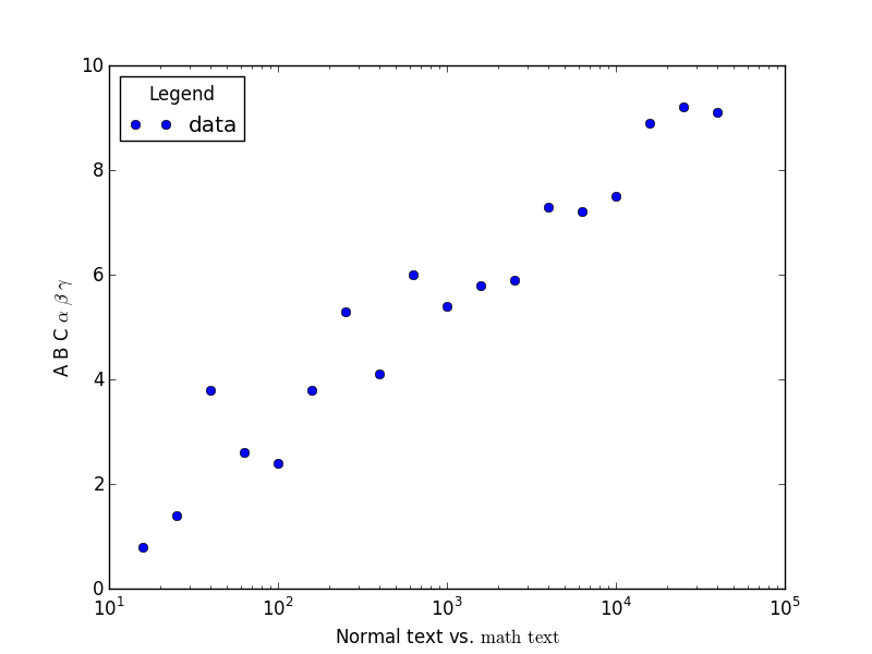
Yikes! There are a number of problems with this figure, including: the text size is too small compared to the other elements, there are no minor tickmarks on the y-axis, the tickmarks are too small, and the fonts are mixed.
Luckily, this can be easily fixed.
Almost everything that I found needed adjustment can be changed from one's
matplotlibrc file. This is what mine looks like:
    # Set the backend, otherwise the figure won't show up. Note that this will
    # depend on your system setup; to see which backend is the default,
    # run "matplotlib.get_backend()" in the Python interpreter.
    backend                 :  GTK3Agg

    # Increase the default DPI, and change the file type from png to pdf
    savefig.dpi             :   300
    savefig.extension       :   pdf

    # Simplify paths by removing "invisible" points, useful for reducing
    # file size when plotting a large number of points
    path.simplify           :   True

    # Instead of individually increasing font sizes, point sizes, and line
    # thicknesses, I found it easier to just decrease the figure size so
    # that the line weights of various components still agree
    figure.figsize          :   4,4

    # In this example I am *not* setting "text.usetex : True", therefore the
    # following ensures that the fonts in math mode agree with the regular ones.
    #
    font.family             :   serif
    mathtext.fontset        :   custom

    # Increase the tick-mark lengths (defaults are 4 and 2)
    xtick.major.size        :   6
    ytick.major.size        :   6
    xtick.minor.size        :   3
    ytick.minor.size        :   3

    # Increase the tick-mark widths as well as the widths of lines
    # used to draw marker edges to be consistent with the other figure
    # linewidths (defaults are all 0.5)
    xtick.major.width       :   1
    ytick.major.width       :   1
    xtick.minor.width       :   1
    ytick.minor.width       :   1
    lines.markeredgewidth   :   1

    # Have the legend only plot one point instead of two, turn off the
    # frame, and reduce the space between the point and the label
    legend.numpoints        :   1
    legend.frameon          :   False
    legend.handletextpad    :   0.3
The final touch is adding minor tickmarks (this is done automatically for logarithmic axes,
but not for linear). This is not possible to set in matplotlibrc, so I just call
ax.minorticks_on() on the axis object(s) in the figure.
    import matplotlib.pyplot as plt
    import numpy as np

    x, y = np.loadtxt("data.txt", skiprows = 1, unpack = True)
    x = 10 ** x

    fig, ax = plt.subplots()
    ax.semilogx(x, y, 'o', label = "data")
    ax.legend(loc = 2, title = "Legend")
    ax.set_xlabel(r"Normal text vs. ${\rm math\, text}$")
    ax.set_ylabel(r"A B C $\alpha$ $\beta$ $\gamma$")

    #
    # Turn on minor ticks!!
    #
    ax.minorticks_on()

    fig.savefig("plot.pdf")
    plt.close(fig)
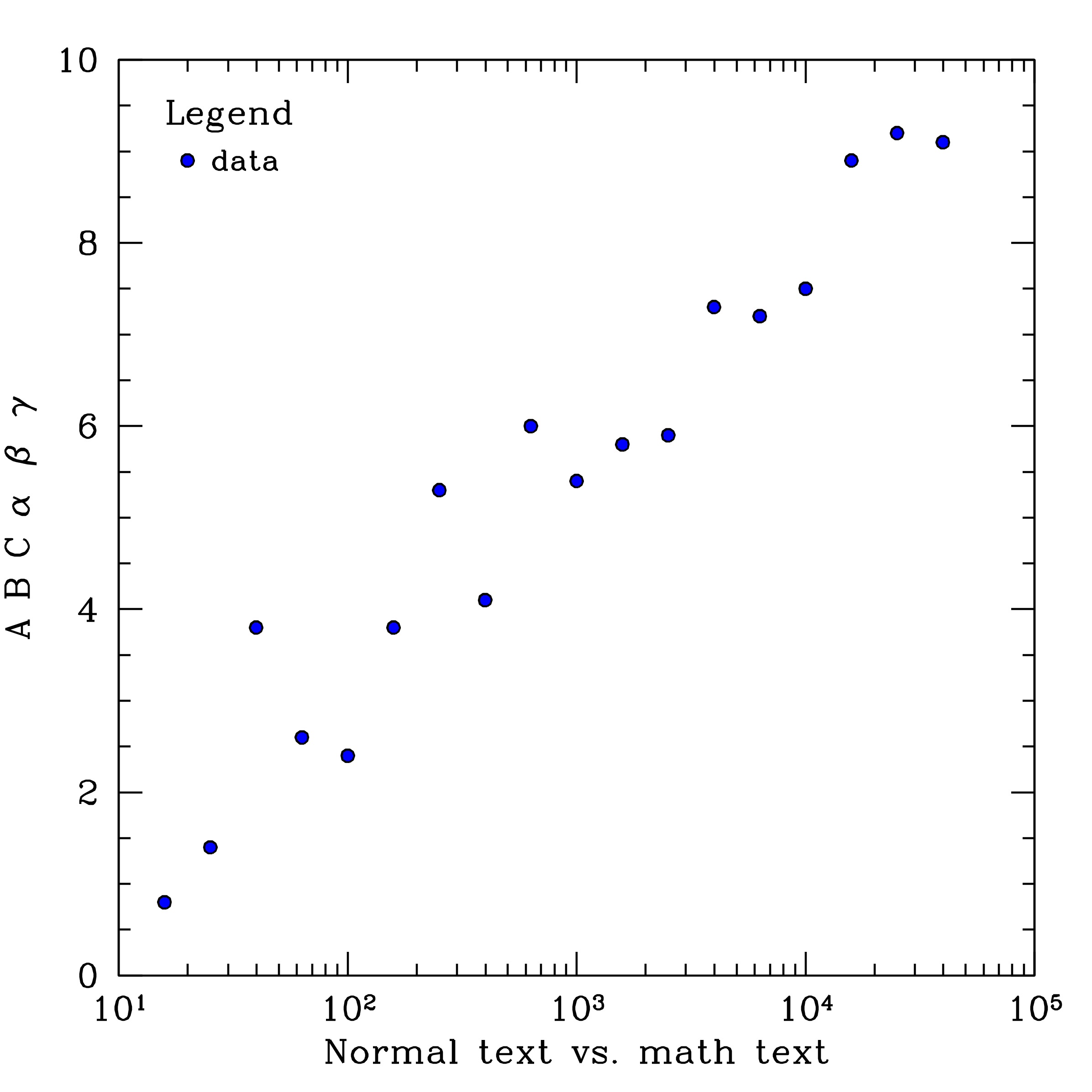
And here is the result:
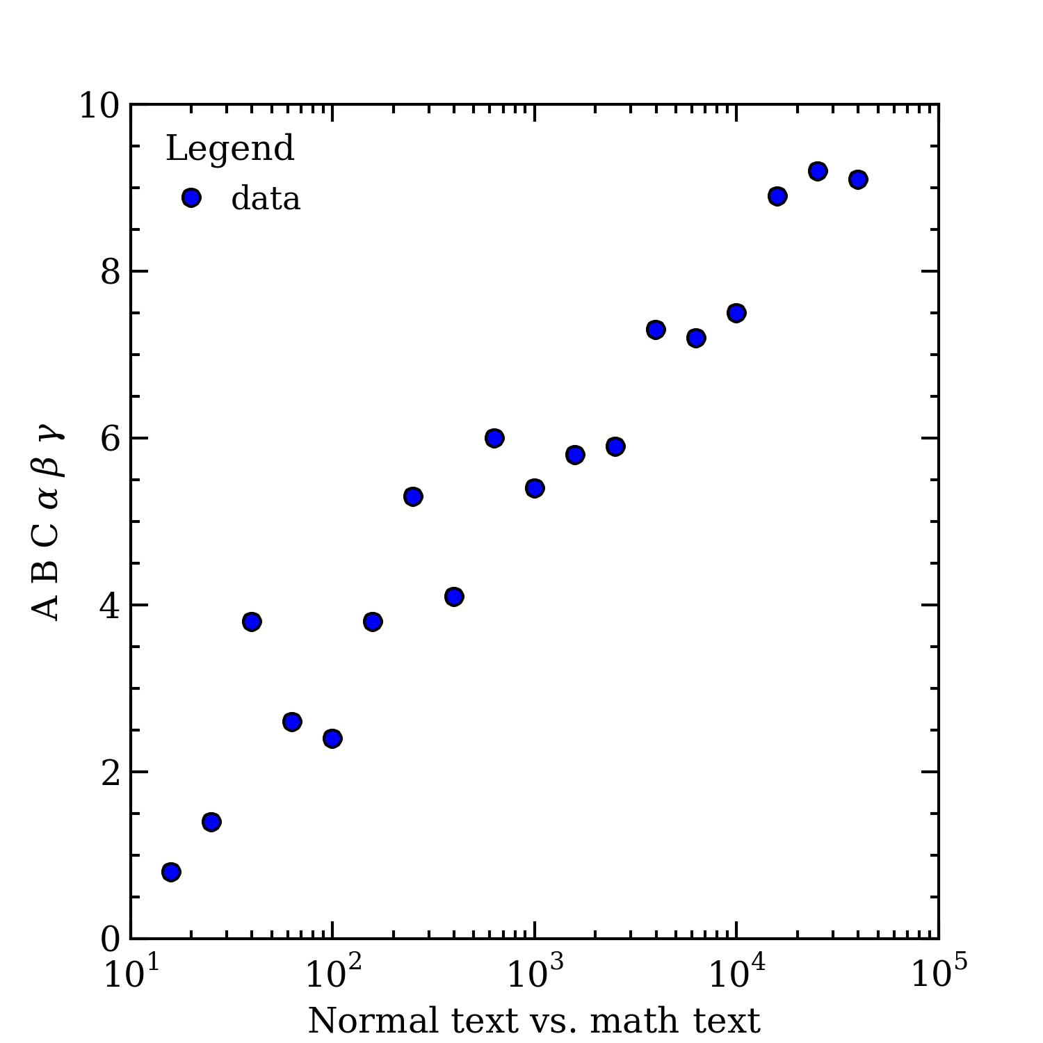
Definitely an improvement!
Finally, a huge thanks to Gabriel-Dominique Marleau who made many helpful suggestions that improved this page.